
Woodward
Dark, premium and editorial — a boutique Bloomfield Hills feel. Full-bleed cross-fading hero, elegant Playfair serif, refined crimson and brass. Projects authority and expense.
Best for a premium, high-end positioning.
Website Redesign · Internal Preview
Three distinct design directions for the firm's dated website, each built from the same content and brand brief. Review all three below and choose the direction you'd like to move forward with. Every concept is fully responsive, mobile-first, and built to turn visitors into phone calls.
Click any concept to open the live homepage, then pick the direction that feels right for the firm. All three are complete and ready to build out — there's no wrong answer.
Dark, premium and editorial — a boutique Bloomfield Hills feel. Full-bleed cross-fading hero, elegant Playfair serif, refined crimson and brass. Projects authority and expense.
Best for a premium, high-end positioning.

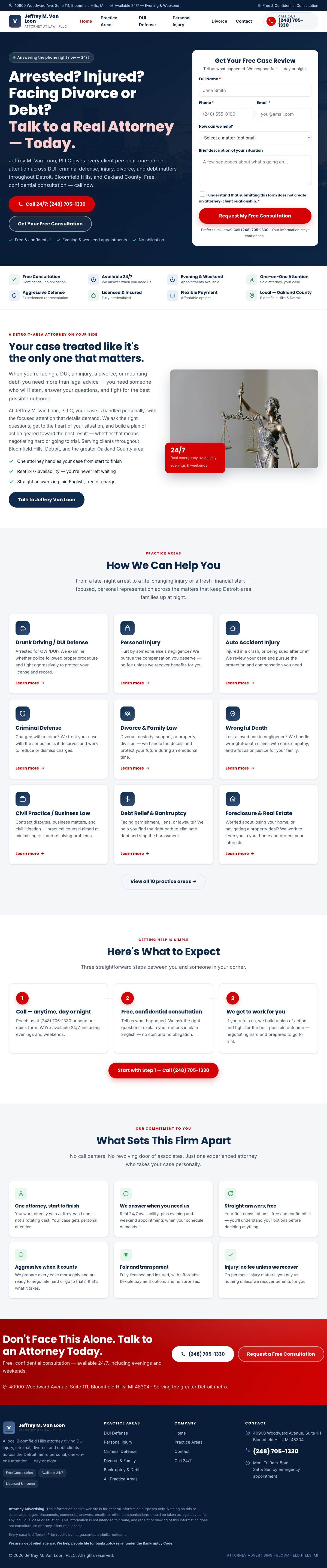
Bright, reassuring and conversion-first. A bold "Arrested? Injured?" headline with a free case-review form right in the hero, trust badges, and red reserved for one thing: the call. Navy + white + signature red.
Best for lead capture — the form sits front and center.
Warm, human and art-directed, leaning into Detroit identity. Fraunces display type, a numbered 01–10 practice index, and a "Rooted in Detroit" riverfront moment. A distinctive local brand.
Best for a distinctive, locally-rooted brand.